Building RepairPal’s First Design System From the Ground Up
As a product designer, I was tasked to create RepairPal's first Design system to streamline design workflows, bring alignment with engineering and design, create organizational frameworks, and define a new visual language for Repairpal.com
Building RepairPal’s First Design System From the Ground Up
As a product designer, I was tasked to create RepairPal's first Design system to streamline design workflows, bring alignment with engineering and design, create organizational frameworks, and define a new visual language for Repairpal.com
Building RepairPal’s First Design System From the Ground Up
As a product designer, I was tasked to create RepairPal's first Design system to streamline design workflows, bring alignment with engineering and design, create organizational frameworks, and define a new visual language for Repairpal.com
About RepairPal
RepairPal.com helps car owners find reputable repair shops to perform a high-quality auto repair at a fair price. Additionally, with RepairPal's Fair Price Estimator car owners can get an accurate range of how much a specific repair would cost for their specific vehicle, avoiding overpaying for auto repair. RepairPal also features a lot of content around car ownership, repairs, reliability ratings, troubleshooting guides, and more to aid car owners in taking care of their vehicles.

The Problem
As we grew from one designer to two, three, and more, we found ourselves in the throes of a logistical nightmare.
UI components were flung far and wide across dozens of Figma files, with our first designer being the only person who knew the whereabouts of these components.
Components and patterns were built in a faulty manner, as breakneck shipping deadlines and lack of design resources had accrued a lot of design debt. More often than not, components and patterns just had to be rebuilt from scratch.
Likewise, with engineering, they had their own library in Storybook that was not in sync with what we had available in Figma. Oftentimes we found ourselves debating whether a new design could rely on an older component or if a new one was needed.
As a result of not having a synchronized system in place between design and engineering, a lot of time was wasted on back-and-forth within the QA process. This was due to not having shared, agreed-upon consistency between design and engineering: spacing structures, grids, and style choices.
Our Approach
In creating a design system, our team chose between two methods.
The first method required creating a system all in one go and then implementing it all at once. The second method is to work on the system in a step-by-step fashion and implement it as you go.
The all-in-one approach has the benefit of being able to tackle a lot of design/technical debt and leaves you with a fully-fledged system that is ready to be utilized. However, there are a few downsides to this method.
It often requires a set amount of dedicated resources and a significant amount of time to build. In other words, this takes designers and engineers away from other priorities and features that could be built at that same time. Another downside is that the system won't be immediately actionable and might cause friction, as the results from the work won't be felt until it is ready to be used.
Given our resources, we opted for the step-by-step approach. This approach allowed us to implement components as we designed them. That way, we could both advocate for the design system and begin to utilize it in a parallel fashion.
The drawback with this approach is that it inherently causes styling inconsistencies: components or patterns that are created later may differ slightly from the visual language of previously created components or patterns.
However, given the circumstances, creating wide-sweeping changes across the site in one go would lead to many issues if not done appropriately. Another consideration to take into account is your design organization's sway with the business.
So with our team deciding to build our design system over time, we could still work on other projects, implement components when ready, and quickly iterate and improve on our system as we learned over time. This approach is more flexible and got us into a regular cadence. This approach set us up for success as we begin to regularly manage our system.

Strategy
We started by identifying and prioritizing what we wanted to accomplish with our design system. We got a cross-functional team together, involving our UX researcher, lead designer, multiple technical leads, and senior engineers, all from different product areas. Then, with that group, we did a white boarding session to brainstorm.
During this session, we laid out possible next steps and areas for improvement and took a vote on which areas were the most critical for the next steps. We concluded that we wanted to first focus on establishing a source of truth for engineering. The following decisions involved, to that point, were:
We decided that Storybook, as a platform, would meet our needs the best.
We also determined that documentation was a critical need for both the design team and the engineering team. This was something that had been missing on the teams for quite some time and we wanted to tackle that with this initiative.
Additionally, we wanted to establish processes: determining the process in adding new components, who was responsible for that, and how other’s can contribute to the design system.
Due to not having dedicated design system resources at the time, we decided that the best path forward would be to create needed components alongside projects. This would be more efficient than setting aside time to build a full system of components, in addition to our current projects.Therefore, product managers would work with their individual designers to identify design system needs. Then the designer and PM from a given product would communicate with the design system team in order to build the component.

The Process
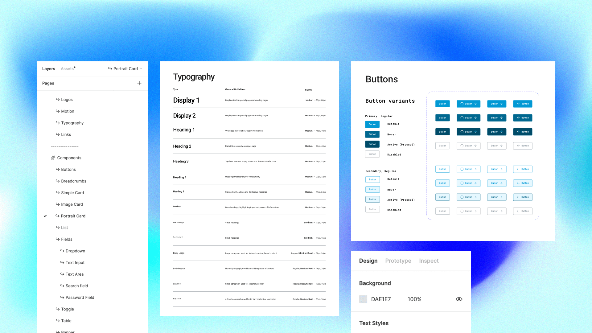
Since we had a loose style guide, we wanted to take the next foundational step -- designing a shared component that would be critical to most of our design’s going forward. This component would “pilot” the new process we discussed and allow us a quick win for the full team. After deliberating with the team, we identified what to pursue: a shared button.
We began with designing the button, for several reasons:
It would serve to be an effective first component. We had several buttons across the full experience, many of which had conflicting styles were built independently, and presented usability and accessibility issues.
When we performed our audit of components, we discovered that many of the buttons had problematic characteristics:
Conflicting styles
Mismatching dimensions
Lack of multiple states
Failed to meet WCAG tap area target minimums of 44px
Lastly, there were accessibility issues such as the colors of buttons failing to meet AA contrast ratios for legibility.
As we discovered these issues, it informed us of immediate areas of improvement for our button.
After this research, I redesigned the buttons to focus on consistency (in padding, typography, and dimensions) and variants (states such as primary, secondary, focus, disabled, etc.)

Documentation
Documentation best practices in Figma was an iterative process with improvements made over time. For example, an engineer mentioned that it was difficult to identify class names of typography in Figma. On further investigation, we learned that names of typography didn’t appear in the inspect view that developers interacted with Figma in. Figma is not always perfect in the handling of these nuanced situations, but there are often workarounds to improve these pain points.
After some desk research, I came across a video from Jan Toman (Schema 2021) where he suggested including class names into the actual name of the saved style. This would allow for the name of the class to appear in the inspect view and made it much simpler for engineering to identify the class. We made that change and promptly solved the problem.One crucial element to having a successful design system is to treat it as a product and to view everyone who interacts and relies on the design system as its users. Having the focus of creating improvements for those users (in this case, engineering), we can improve upon the experience and make it easier and more efficient for the users to engage with the design system.
Parity with Developers
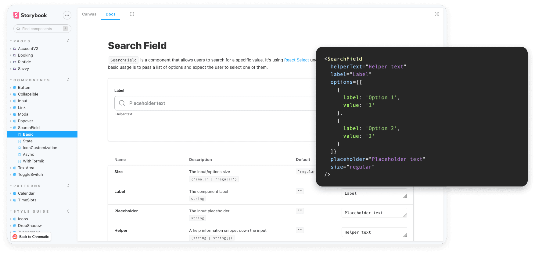
Documentation and storage of components on the engineering side were handled in Storybook. We decided to utilize Storybook for several reasons. One is that the engineering team had already begun to utilize it prior to our design system. Two is the ability to utilize Storybook for its support and tools available that we could take advantage of for our design system. Storybook had plug-ins, widgets, etc. that would help showcase redlines for styling specs, connect code to Figma, and tools for us to match better match components between code and design.
To do this properly we decided to create a new Storybook that would match the structure we created on the design side. Previously, components were organized by sections of the site and where they lived. With the newly created Storybook, we wanted to match the mental models of Atomic design and separate our system into three categories to start. These categories were Style Guide (for type, colors, elevation, etc.), components (buttons, cards, input field, etc.), and patterns (Shop Card, navigation, etc.). Shifting to this framework allowed the team to approach the system with a building block mindset.
As we established Storybook we wanted to connect the bridge between Storybook and Figma. This was critical for the success of the system and parity between design and code. We connected our designs directly to our Storybook by utilizing the design add-on by Storybook. This allowed us to link our designs from Figma within to their corresponding coded component. Having this meant we could quickly reference components between design and code and easily match the two.When it came time to create documentation for our system, having that link to our design file was key. This is because I made an effort to write extensive documentation on each component made within Figma. This documentation included guidance on use cases, UX considerations, behaviors, and styling notes. The engineering team would often reference these guidelines in the creation of the component.
When it came time to create documentation in Storybook, the engineers would reference the Figma documentation I created as a launchpad for the documentation they would create in Storybook.This helped fuel the cross-functional team members to be able to collaborate and create documentation that both addressed the needs of engineering and design. Documentation ultimately served as a source of truth for various teams. The educational aspect of our documentation provided a huge opportunity to expand our knowledge together. Making it possible for more team members to gain technical and UX knowledge when it came to the interface, and to better empathize with team members across different disciplines.
As we created documentation in StoryBook, we would often find areas for improvement. For example, we initially began with utilizing the knobs feature. The knobs feature allowed us to create an interactive view of our components and allowed anyone to be able to change between the various states we had for a component.However, we later identified that this feature was quickly going out of favor and lacked functionality. The knobs option only worked within a specific tab and made it difficult to have documentation on the same page. This led to having to constantly change between tabs within Storybook, which was not ideal. As a result, we decided to switch over to a new add-on that was created by Storybook known as “controls”. We migrated to controls from knobs, and now we were able to have a refined all-in-one page with variants and our documentation.
Going Forward
The ongoing effort in creating RepairPal's first Design System has been successful in bridging the gap between the design and engineering team and allowed us to work closely and effectively. The process of creating a design system is long and never-ending. There are still many components to create, CSS to refactor, and improvements that arise from the process.Going forward I'm looking towards establishing metrics to measure success in some way. To start, I'd like to measure the adoption rate within the codebase.
This way we can understand the extent to which we are tackling technical debt, and showcase how reusable components are easily propagated within the product.Another area that needs to be addressed is the design token mental model. With this, we want to take a look at the way we are naming styles and give them semantic meaning versus long convoluted styling.
I originally opted to not introduce this as we had quite an extensive technical debt to address. This coupled with how CSS is currently handled meant we had some limitations in our approach.In conclusion, creating a design system lead to an organizational shift within RepairPal. Formalizing metrics and the ongoing communication of its reach will be crucial to establish as we continue our efforts.
About RepairPal
RepairPal.com helps car owners find reputable repair shops to perform a high-quality auto repair at a fair price. Additionally, with RepairPal's Fair Price Estimator car owners can get an accurate range of how much a specific repair would cost for their specific vehicle, avoiding overpaying for auto repair. RepairPal also features a lot of content around car ownership, repairs, reliability ratings, troubleshooting guides, and more to aid car owners in taking care of their vehicles.
The Problem
As we grew from one designer to two, three, and more, we found ourselves in the throes of a logistical nightmare.
UI components were flung far and wide across dozens of Figma files, with our first designer being the only person who knew the whereabouts of these components.
Components and patterns were built in a faulty manner, as breakneck shipping deadlines and lack of design resources had accrued a lot of design debt. More often than not, components and patterns just had to be rebuilt from scratch.
Likewise, with engineering, they had their own library in Storybook that was not in sync with what we had available in Figma. Oftentimes we found ourselves debating whether a new design could rely on an older component or if a new one was needed.
As a result of not having a synchronized system in place between design and engineering, a lot of time was wasted on back-and-forth within the QA process. This was due to not having shared, agreed-upon consistency between design and engineering: spacing structures, grids, and style choices.
Our Approach
In creating a design system, our team chose between two methods.
The first method required creating a system all in one go and then implementing it all at once. The second method is to work on the system in a step-by-step fashion and implement it as you go.
The all-in-one approach has the benefit of being able to tackle a lot of design/technical debt and leaves you with a fully-fledged system that is ready to be utilized. However, there are a few downsides to this method.
It often requires a set amount of dedicated resources and a significant amount of time to build. In other words, this takes designers and engineers away from other priorities and features that could be built at that same time. Another downside is that the system won't be immediately actionable and might cause friction, as the results from the work won't be felt until it is ready to be used.
Given our resources, we opted for the step-by-step approach. This approach allowed us to implement components as we designed them. That way, we could both advocate for the design system and begin to utilize it in a parallel fashion.
The drawback with this approach is that it inherently causes styling inconsistencies: components or patterns that are created later may differ slightly from the visual language of previously created components or patterns.
However, given the circumstances, creating wide-sweeping changes across the site in one go would lead to many issues if not done appropriately. Another consideration to take into account is your design organization's sway with the business.
So with our team deciding to build our design system over time, we could still work on other projects, implement components when ready, and quickly iterate and improve on our system as we learned over time. This approach is more flexible and got us into a regular cadence. This approach set us up for success as we begin to regularly manage our system.
Strategy
We started by identifying and prioritizing what we wanted to accomplish with our design system. We got a cross-functional team together, involving our UX researcher, lead designer, multiple technical leads, and senior engineers, all from different product areas. Then, with that group, we did a white boarding session to brainstorm.
During this session, we laid out possible next steps and areas for improvement and took a vote on which areas were the most critical for the next steps. We concluded that we wanted to first focus on establishing a source of truth for engineering. The following decisions involved, to that point, were:
We decided that Storybook, as a platform, would meet our needs the best.
We also determined that documentation was a critical need for both the design team and the engineering team. This was something that had been missing on the teams for quite some time and we wanted to tackle that with this initiative.
Additionally, we wanted to establish processes: determining the process in adding new components, who was responsible for that, and how other’s can contribute to the design system.
Due to not having dedicated design system resources at the time, we decided that the best path forward would be to create needed components alongside projects. This would be more efficient than setting aside time to build a full system of components, in addition to our current projects.Therefore, product managers would work with their individual designers to identify design system needs. Then the designer and PM from a given product would communicate with the design system team in order to build the component.
The Process
Since we had a loose style guide, we wanted to take the next foundational step -- designing a shared component that would be critical to most of our design’s going forward. This component would “pilot” the new process we discussed and allow us a quick win for the full team. After deliberating with the team, we identified what to pursue: a shared button.
We began with designing the button, for several reasons:
It would serve to be an effective first component. We had several buttons across the full experience, many of which had conflicting styles were built independently, and presented usability and accessibility issues.
When we performed our audit of components, we discovered that many of the buttons had problematic characteristics:
Conflicting styles
Mismatching dimensions
Lack of multiple states
Failed to meet WCAG tap area target minimums of 44px
Lastly, there were accessibility issues such as the colors of buttons failing to meet AA contrast ratios for legibility.
As we discovered these issues, it informed us of immediate areas of improvement for our button.
After this research, I redesigned the buttons to focus on consistency (in padding, typography, and dimensions) and variants (states such as primary, secondary, focus, disabled, etc.)
Documentation
Documentation best practices in Figma was an iterative process with improvements made over time. For example, an engineer mentioned that it was difficult to identify class names of typography in Figma. On further investigation, we learned that names of typography didn’t appear in the inspect view that developers interacted with Figma in. Figma is not always perfect in the handling of these nuanced situations, but there are often workarounds to improve these pain points.
After some desk research, I came across a video from Jan Toman (Schema 2021) where he suggested including class names into the actual name of the saved style. This would allow for the name of the class to appear in the inspect view and made it much simpler for engineering to identify the class. We made that change and promptly solved the problem.One crucial element to having a successful design system is to treat it as a product and to view everyone who interacts and relies on the design system as its users. Having the focus of creating improvements for those users (in this case, engineering), we can improve upon the experience and make it easier and more efficient for the users to engage with the design system.
Parity with Developers
Documentation and storage of components on the engineering side were handled in Storybook. We decided to utilize Storybook for several reasons. One is that the engineering team had already begun to utilize it prior to our design system. Two is the ability to utilize Storybook for its support and tools available that we could take advantage of for our design system. Storybook had plug-ins, widgets, etc. that would help showcase redlines for styling specs, connect code to Figma, and tools for us to match better match components between code and design.
To do this properly we decided to create a new Storybook that would match the structure we created on the design side. Previously, components were organized by sections of the site and where they lived. With the newly created Storybook, we wanted to match the mental models of Atomic design and separate our system into three categories to start. These categories were Style Guide (for type, colors, elevation, etc.), components (buttons, cards, input field, etc.), and patterns (Shop Card, navigation, etc.). Shifting to this framework allowed the team to approach the system with a building block mindset.
As we established Storybook we wanted to connect the bridge between Storybook and Figma. This was critical for the success of the system and parity between design and code. We connected our designs directly to our Storybook by utilizing the design add-on by Storybook. This allowed us to link our designs from Figma within to their corresponding coded component. Having this meant we could quickly reference components between design and code and easily match the two.When it came time to create documentation for our system, having that link to our design file was key. This is because I made an effort to write extensive documentation on each component made within Figma. This documentation included guidance on use cases, UX considerations, behaviors, and styling notes. The engineering team would often reference these guidelines in the creation of the component.
When it came time to create documentation in Storybook, the engineers would reference the Figma documentation I created as a launchpad for the documentation they would create in Storybook.This helped fuel the cross-functional team members to be able to collaborate and create documentation that both addressed the needs of engineering and design. Documentation ultimately served as a source of truth for various teams. The educational aspect of our documentation provided a huge opportunity to expand our knowledge together. Making it possible for more team members to gain technical and UX knowledge when it came to the interface, and to better empathize with team members across different disciplines.
As we created documentation in StoryBook, we would often find areas for improvement. For example, we initially began with utilizing the knobs feature. The knobs feature allowed us to create an interactive view of our components and allowed anyone to be able to change between the various states we had for a component.However, we later identified that this feature was quickly going out of favor and lacked functionality. The knobs option only worked within a specific tab and made it difficult to have documentation on the same page. This led to having to constantly change between tabs within Storybook, which was not ideal. As a result, we decided to switch over to a new add-on that was created by Storybook known as “controls”. We migrated to controls from knobs, and now we were able to have a refined all-in-one page with variants and our documentation.
Going Forward
The ongoing effort in creating RepairPal's first Design System has been successful in bridging the gap between the design and engineering team and allowed us to work closely and effectively. The process of creating a design system is long and never-ending. There are still many components to create, CSS to refactor, and improvements that arise from the process.Going forward I'm looking towards establishing metrics to measure success in some way. To start, I'd like to measure the adoption rate within the codebase.
This way we can understand the extent to which we are tackling technical debt, and showcase how reusable components are easily propagated within the product.Another area that needs to be addressed is the design token mental model. With this, we want to take a look at the way we are naming styles and give them semantic meaning versus long convoluted styling.
I originally opted to not introduce this as we had quite an extensive technical debt to address. This coupled with how CSS is currently handled meant we had some limitations in our approach.In conclusion, creating a design system lead to an organizational shift within RepairPal. Formalizing metrics and the ongoing communication of its reach will be crucial to establish as we continue our efforts.
