Improving RepairPal’s Log In Experience
Summary As a product designer, I was tasked with redesigning the user account creation process and logging in. Our goal with the project was to streamline signing up, fix bugs, address usability issues, and establish infrastructure for better analytics. The project was in an effort leading up to the rollout of consumer-focused products. A robust signup/login process that is easy to use, and frictionless lets our users get to what they need easily.


Team
I was the lead product designer on the project responsible for the end-to-end process, working alongside a UX Researcher, 2 Engineers, and a Product Manager.
About Repairpal
RepairPal.com helps car owners find reputable repair shops to perform a high-quality auto repair at a fair price. Additionally, with RepairPal's Fair Price Estimator car owners can get an accurate range of how much a specific repair would cost for their specific vehicle, avoiding overpaying for auto repair. RepairPal also features a lot of content around car ownership, repairs, reliability ratings, troubleshooting guides, and more to aid car owners in taking care of their vehicles.
Platform
Responsive Web
Timeline
8 Weeks


Identifying the Problem
The current account sign-up experience was unintuitive and had bugs that made it difficult for users to create an account. The interface lacked clarity and suffered from a broken captcha system.
Users were often found stuck in a loop with captcha, and confusing error messages lead to unsuccessful signups. As a result, user account creation was stagnant, and most users hardly interacted with their accounts.
RepairPal was focused on consumer growth initiatives and wanted to create products for its B2C business. Having a robust account creation process was critical for future growth initiatives to succeed.


Research
My team started by conducting research. We wanted to understand user intent and the value of having an account at RepairPal provided. We also wanted to understand, why do so many users not create accounts or return to them?
Our findings showed us that users were signing in to perform a few actions. These included adding their vehicle information and updating their settings. Intending to create account experiences for our users, we wanted to first ensure the account creation process was frictionless. To validate the issues with the account creation flow, we performed usability testing on the current experience.
Key research insights from usability testing:
Users were getting stuck by a broken captcha
Users were attempting to recreate their account due to a misleading error message
Unclear password requirements slowed users down
Goals
For the redesign of the log in sign up experience, it was important to create an experience that would be:
Modern, minimal interface, free of bugs
A secure solution that instills strong password security, and is sensitive to brute force/malicious attempts of account hijacking
Incorporate new design system components
Create a flow that could be easily tracked and be iterated on in the future
Design details
I tackled the project in a few phases: Sign up flow, log-in flow, and password recovery flow.

A streamlined experience through a stepped flow
Originally we had considered either going down the route of having a magic link sign-on or a stepped flow. With some constraints around relying on a third party for magic links, we opted for a stepped flow. Our previous account creation experience was a simple modal. The new flow takes the user on a stepped experience that guides them through the account creation and into the user account page. Not only does this pattern follow more modern expectations of an account creation experience, but it also simplified it. Even though users now go through more pages, they view fewer fields per page and thus became more likely to complete signing up than before. We saw that the average completion increased, despite increasing pages.

Clarity with clear states for errors
Many of the fields in the original flow were missing proper error states, making it unclear for the user to troubleshoot where they went wrong. Throughout the design with the usage of our new input field component from our design system, error message handling was much more consistent across the experience.

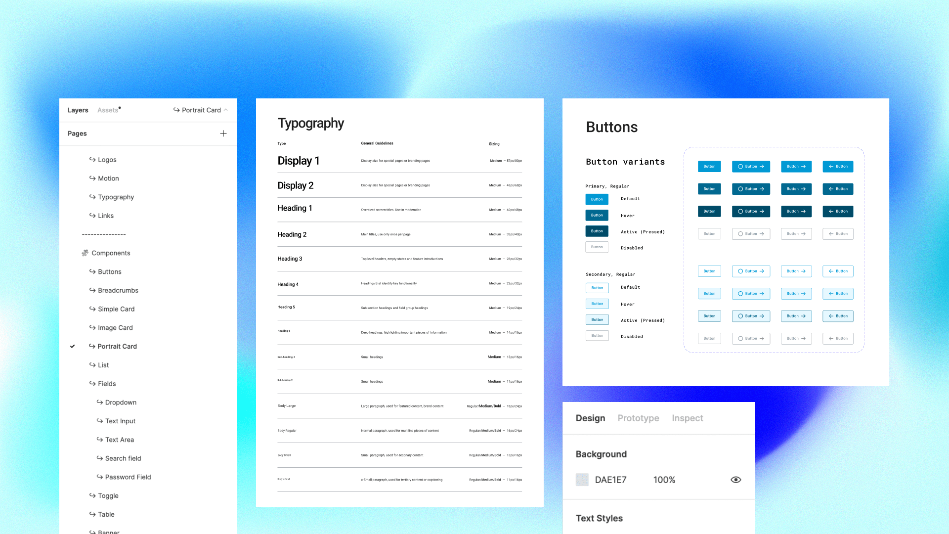
Utilizing/creating design system components
As we began building our design system for RepairPal, we wanted to incorporate our new input field component. This made handling things such as making sure we had all the proper states and errors consistent. As a result of this project, we also contributed to our design system with the creation of the toast banner component. The toast banner is utilized to share messages with the user around success, errors, and status states.
Team
I was the lead product designer on the project responsible for the end-to-end process, working alongside a UX Researcher, 2 Engineers, and a Product Manager.
About Repairpal
RepairPal.com helps car owners find reputable repair shops to perform a high-quality auto repair at a fair price. Additionally, with RepairPal's Fair Price Estimator car owners can get an accurate range of how much a specific repair would cost for their specific vehicle, avoiding overpaying for auto repair. RepairPal also features a lot of content around car ownership, repairs, reliability ratings, troubleshooting guides, and more to aid car owners in taking care of their vehicles.
Platform
Responsive Web
Timeline
8 Weeks
Identifying the Problem
The current account sign-up experience was unintuitive and had bugs that made it difficult for users to create an account. The interface lacked clarity and suffered from a broken captcha system.
Users were often found stuck in a loop with captcha, and confusing error messages lead to unsuccessful signups. As a result, user account creation was stagnant, and most users hardly interacted with their accounts.
RepairPal was focused on consumer growth initiatives and wanted to create products for its B2C business. Having a robust account creation process was critical for future growth initiatives to succeed.
Research
My team started by conducting research. We wanted to understand user intent and the value of having an account at RepairPal provided. We also wanted to understand, why do so many users not create accounts or return to them?
Our findings showed us that users were signing in to perform a few actions. These included adding their vehicle information and updating their settings. Intending to create account experiences for our users, we wanted to first ensure the account creation process was frictionless. To validate the issues with the account creation flow, we performed usability testing on the current experience.
Key research insights from usability testing:
Users were getting stuck by a broken captcha
Users were attempting to recreate their account due to a misleading error message
Unclear password requirements slowed users down
Goals
For the redesign of the log in sign up experience, it was important to create an experience that would be:
Modern, minimal interface, free of bugs
A secure solution that instills strong password security, and is sensitive to brute force/malicious attempts of account hijacking
Incorporate new design system components
Create a flow that could be easily tracked and be iterated on in the future
Design details
I tackled the project in a few phases: Sign up flow, log-in flow, and password recovery flow.
A streamlined experience through a stepped flow
Originally we had considered either going down the route of having a magic link sign-on or a stepped flow. With some constraints around relying on a third party for magic links, we opted for a stepped flow. Our previous account creation experience was a simple modal. The new flow takes the user on a stepped experience that guides them through the account creation and into the user account page. Not only does this pattern follow more modern expectations of an account creation experience, but it also simplified it. Even though users now go through more pages, they view fewer fields per page and thus became more likely to complete signing up than before. We saw that the average completion increased, despite increasing pages.
Clarity with clear states for errors
Many of the fields in the original flow were missing proper error states, making it unclear for the user to troubleshoot where they went wrong. Throughout the design with the usage of our new input field component from our design system, error message handling was much more consistent across the experience.
Utilizing/creating design system components
As we began building our design system for RepairPal, we wanted to incorporate our new input field component. This made handling things such as making sure we had all the proper states and errors consistent. As a result of this project, we also contributed to our design system with the creation of the toast banner component. The toast banner is utilized to share messages with the user around success, errors, and status states.